Creating Solutions During COVID: Refactoring a Fintech and a Health App
Let’s start being honest about one thing: COVID hit us hard. Besides creating a health crisis in several countries, the pandemic harshly affected social and economic lives across the globe. As many other teams, we also found ourselves and our loved ones in danger, let alone our projects. Some clients were forced to stop their activity for some time. Others had to postpone their ideas due to lack of financial resources. There were cases in which our professionals asked to keep working in a key project, even if that meant doing it for free.
This is what made us realise something: we all wanted to help. No matter how, we felt like we had to do our bit.
And so we created Recovery Rocket, a program for all businesses whose activity had been affected by the pandemic. Whether big or small, all companies and entrepreneurs meeting that condition could apply and receive free services in terms of product design, usability and development. This initiative, which got a very warm welcome, allowed us to collaborate with several businesses around Europe and to help them improve their digital products. Most of the crew got involved at one point or another, but since I’m part of the Product Design team I was able to participate in all of them and have a comprehensive understanding of what we did.
In this post I would like to talk about two specific cases in which we worked that got pretty interesting results: a fintech and a health app. Due to the projects’ confidentiality clauses, I cannot specify certain features we included, but that will not affect the explanation of the work process.
The program had a duration of one week working in each challenge, so we had to drastically adapt our traditional working methodology to maximise results in little time. In both cases, we improved the access flow to the platforms, reducing the bounce rate and increasing conversions.
How did we do it?
Good design is essential to get a good product. As simple as that. It must combine functionality and form, and address issues such as sustainability, creativity, simplicity, ergonomics or innovation.
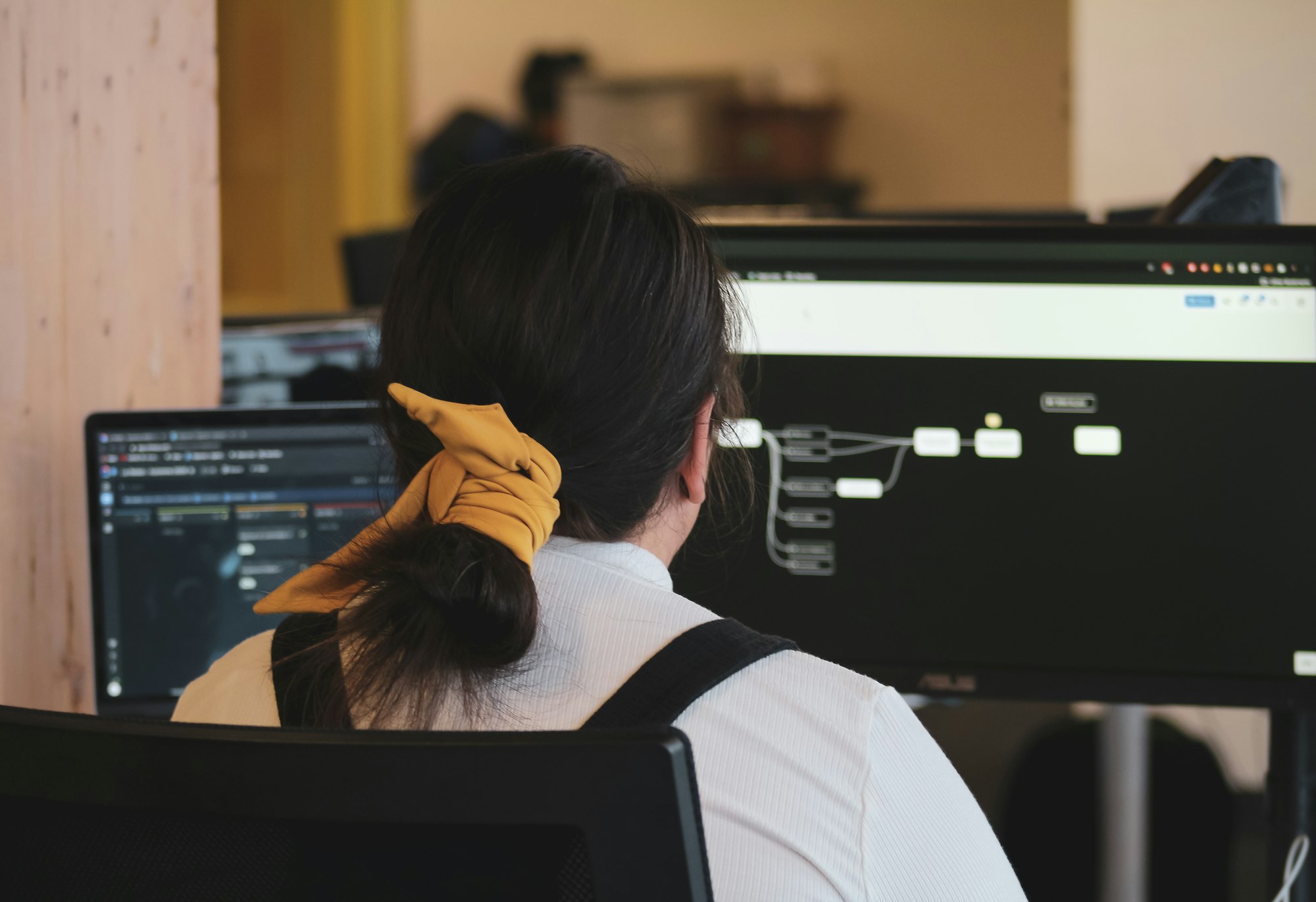
Because we needed to operate in a very dynamic and agile way, we focused on those features that could be easily tested and improved, breaking the process in small tasks. This gave us quick wins which, in turn improved the usability of each product.
Of course, this wouldn’t have been possible without a great coordination among all members of the team. Our Design Lead and I worked closely in every project we started, and gave tasks to other team members whenever we needed them.
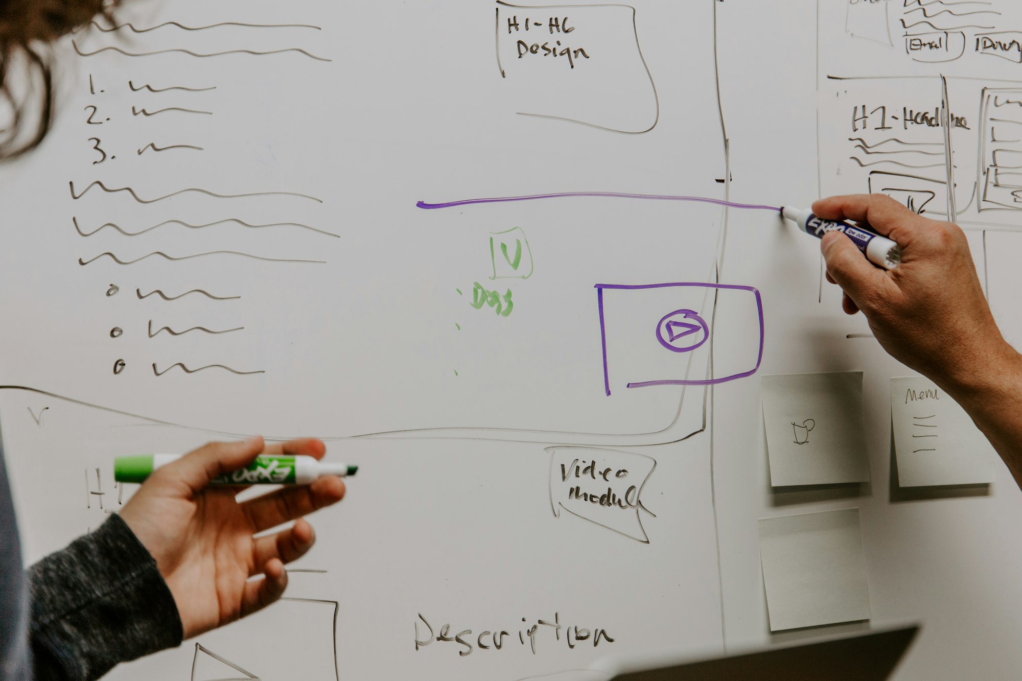
This is how we planned the entire projects:
- First, we prepared a plan of all the micro tasks and distributed them along the five days that the process would last.
- We also defined a series of daily meetings to see the progress and share impressions.
- Afterwards, we continued analysing the product, obtaining pain points and analysing similar products in search of improvements.
- We went on generating ideas on how to improve their flow.
- Finally, we produced a high-level prototype, which we shared with the client in the final meeting.
Now let’s get down to how the process went with each project.
Refactoring a fintech app: an agile, intuitive and personalised experience
The first thing we did after learning about the needs of the project was to make a list of what we should be addressing throughout the week. This list included:
- Analysing and documenting UX issues and solutions.
- Redesigning the user authentication flow.
- Redesigning the advance flow.
- Redesigning the application UI layout design.
- Redesigning UI components library.
Thanks to this list we were able to have a general overview of the entire project and prioritise tasks.
Discovery and Definition
We requested access to the client and downloaded the app. We analysed the entire registration and login flow, as well as the steps that the user had to take. We translated all those screens into various streams and then added notes on potential pain points.
The process continued with an exhaustive analysis, comparing the platform to similar products and applications from the banking sector. We realised that most of them were using the telephone number to verify access.
We also wanted to add value to the product, increasing safety, so we added several technologies that would allow the user to access the app in a much easier, faster and safer way.
We documented the entire analysis and started to discuss the best way to redesign the app.
Ideation
After the benchmark analysis, we understood that the best way to access the app would be by verifying the mobile phone. Users who had downloaded the application needed their company to give them access and verify their identity. So far, they were gaining access through their ID (DNI/NIE in Spain). However, just as the ID was the user’s personal information, so was the mobile phone, and thus we decided to change the registration system and use this information instead.
We also started preparing high-quality wireframes to save time. With these wireframes, we generated new user flows and analysed these new journeys through the app. We did several iterations changing and improving specific aspects and eventually we obtained a much more optimal and attractive result than the previous one.
Finally, we edited the original library, adding some extra colours and improving the style of the texts. We used the positive version of the logo for the Splash screen and illustrations for the onboarding screens.
Result
Besides improving the access flow, as I have previously noted, we improved other aspects of the application too, so it became more secure.
We also analysed the existing flow and created a new one; defined the landing screen; and created a new dashboard for visualising information by adding a chart and a history of bank movements.
Our conclusions on this fintech project
After the week working with our client, I feel like the outcome was positive. We managed to adjust to the tight schedule and adapt our working routines in an agile and productive way. Personally, I think that the improvements proposed in this project could add value and make it easier for people to use the app. Thanks to the extensive research process, we managed to change the registration method and add several secure technologies that personalise the experience. To top it up, the change to the UI made the layout cleaner and much more intuitive.
Refactoring a health app: solving the right problem to increase conversions
Our second project focused on an app which helps people with Chron's enhance their quality of life by providing tips and advice on how to change certain habits and behaviours. It partners with hospitals, insurers, pharmaceutical companies and other companies to distribute their app to potential patients. These partners are the final clients as they pay a fee per user.
Its main problem was that, besides being a great tool, the landing page had a huge bounce rate and people didn’t use the app. Once we found this out, we realised we had to tackle the way people accessed the platform, and how they registered their interest.
In this specifi case, we placed great importance on understanding the access flow and data analysis.
Discovery
Until now, this company selected certain partners or associates and sent them invitation codes. They could then distribute these codes to their users so that they could register in the application. The invitation code had to be redeemed on the registration page to allow the user to complete the process and access the app. Without a valid invitation code, the register couldn’t be completed.
Users could apply this code in two different ways:
- Landing page: the registration page required users to manually fill in their name and email, as well as the invitation code provided by the partner. This could have been received via the partner's email campaigns, website, or printed marketing materials.
- Invitation link: the code was inserted as a token in a URL so registration could be completed without the user knowing. This link could be included in email campaigns or associated websites. This would prevent users from having to fill in a form, saving time and efforts.
We realised that intertwining the physical and the digital medium was a major obstacle in terms of user experience. We wanted to avoid that breach and make the entire process digital. To do this, we examined several users’ journeys and performed a heuristic analysis. This kind of analysis consists of a series of checks that ensure the usability and the achievement of business objectives of the application, obtaining conclusions and proposals for improvement. We also use tools like Hotjar, and the combination of all insights helps us to improve the product.
As a result, this research we obtained a broad-ranging list of errors, some of them related to:
- The top menus were different in the registration and on the home page.
- Navigation restrictions.
- The input placeholders repeat the message of the labels making it confusing.
- The validation errors are in mixed languages.
- Entries and text lack contrast and are not accessible.
- Different display on iOS and Android, layout with errors.
Definition
We defined several flows that the user could follow to access the platform:
- Landing page. If the user had an invitation, they could easily enter the app by filling this specific field. If, by any chance, they didn’t have it, they could request it by completing a simple contact form.
- Invitation via email. The code previously provided by a physical medium would be replaced by a digital code and the link to the landing page, from an email.
- The user (already registered) could login in a much easier way. Besides, we included a password reset option, which didn’t exist.
Ideation
As we also did with the fintech app, we decided to start with some high definition wireframes based on the initial landing page. Therefore, all the screens and user flows defined revolved around this concept.
We added the landing’s top menu to the access screen, to give the user more control and to allow him to change screens more easily. We also divided the screen in half. On the left, we included a short tutorial through which the user received information about the platform. This tutorial was filled with illustrations and a short descriptive text, to encourage him to enrol.
On the right side we placed a simpler, easier-to-fill contact form. We added descriptive texts, informative messages below the inputs, new icons, new links and standardised all the components in the platform.
Finally, we applied our client’s corporate colours and made sure it was accessible.
Our conclusions on this health project
This project’s biggest challenge was, without a doubt, understanding why potential users weren’t taking advantage of a tool as convenient as this platform.
I personally believe that the research and analysis of all access flows have been key to lowering the bounce rate as much as possible. In just one week we were able to manage our tasks, reach common ground with the client, and redesign the way that users will access and enjoy the service.
Recovery Rocket: that’s a wrap!
What started as a strategy to help the start-up ecosystem has ended up being a very positive and meaningful project for the Acid Tango team. We have not only learned new ways of working and coordinating ourselves under a greater pressure than usual, but we have also developed lasting relationships with the companies we helped. In fact, several of the projects in which we are currently immersed started precisely from those free pilot projects offered through the Recovery Rocket program. As the economy slowly recovers from the effects of the pandemic, we can only hope that these businesses keep working in their digital product and thrive.
What part did you find more appealing? Would you be interested in reading more case studies like these ones in the future? Let me know in the comments section. In the meantime, you can find more articles about UX/UI challenges in my Medium profile.
Thanks for reading!