How Many Screens Should an MVP Have?
When building a minimum viable product (MVP), one of the most common and critical questions is: how many screens should it include? The answer depends on your product’s scope and goals, but the principle is always the same (KEEP IT LEAN, FOCUSED, AND FUNCTIONAL)
Today we explore how to determine the right number of screens for an MVP, how to prioritize them, and why it matters from a product development and business perspective.
What is an MVP?
We've already discussed what an MVP is extensively (you can find a lot of info in our blog). But, shortly: a minimum viable product is the simplest version of your product that allows you to test your core idea with real users. Unlike a prototype, an MVP is fully functional (that’s different becuase it lets users complete the core journey, not just visualize it. And unlike a beta, it’s not a near-final version with most features in place): it's stripped down to just the essentials needed to deliver value and gather feedback.
The purpose of an MVP is to:
- Validate assumptions
- Reduce time-to-market
- Minimize development cost
- Learn from real users early
The fewer screens your MVP has, the faster you can build it and start learning.
Why screen count matters in MVP development
Each additional screen in an MVP increases:
- Development time
- Design and testing effort
- Complexity in the user flow
- Budget and maintenance
In contrast, a limited number of screens helps focus on the core user journey and keeps things simple for both users and the development team.
For example, one of our clients reduced their MVP from 15 to just 7 key screens, and we were able to cut development time by 35%, while keeping the user experience focused and effective.
How to decide how many screens you need in an MVP
There’s no fixed number, but most MVPs include between 5 and 10 screens. The key is identifying the smallest set of screens needed to test your main value proposition.
For more complex products (like B2B dashboards or marketplaces) you might need a few more, but only if they’re essential to validate the core value loop. Every screen should have a clear purpose tied to learning or delivering value.
Follow this framework:
1️⃣ Define your primary user flow
Start by asking:
- What is the main problem my product solves?
- What is the shortest path from user entry to delivered value?
Map out this flow. Every screen that supports it is a candidate for inclusion.
2️⃣ Cut out non-essential features
Ask yourself if each screen contributes to:
- Delivering the core value
- Enabling user input or feedback
- Supporting a basic user journey
If it doesn’t, leave it out.
3️⃣ Prototype before development
Before writing code, build wireframes or mockups. Tools like Figma help visualize the full experience and identify unnecessary complexity.
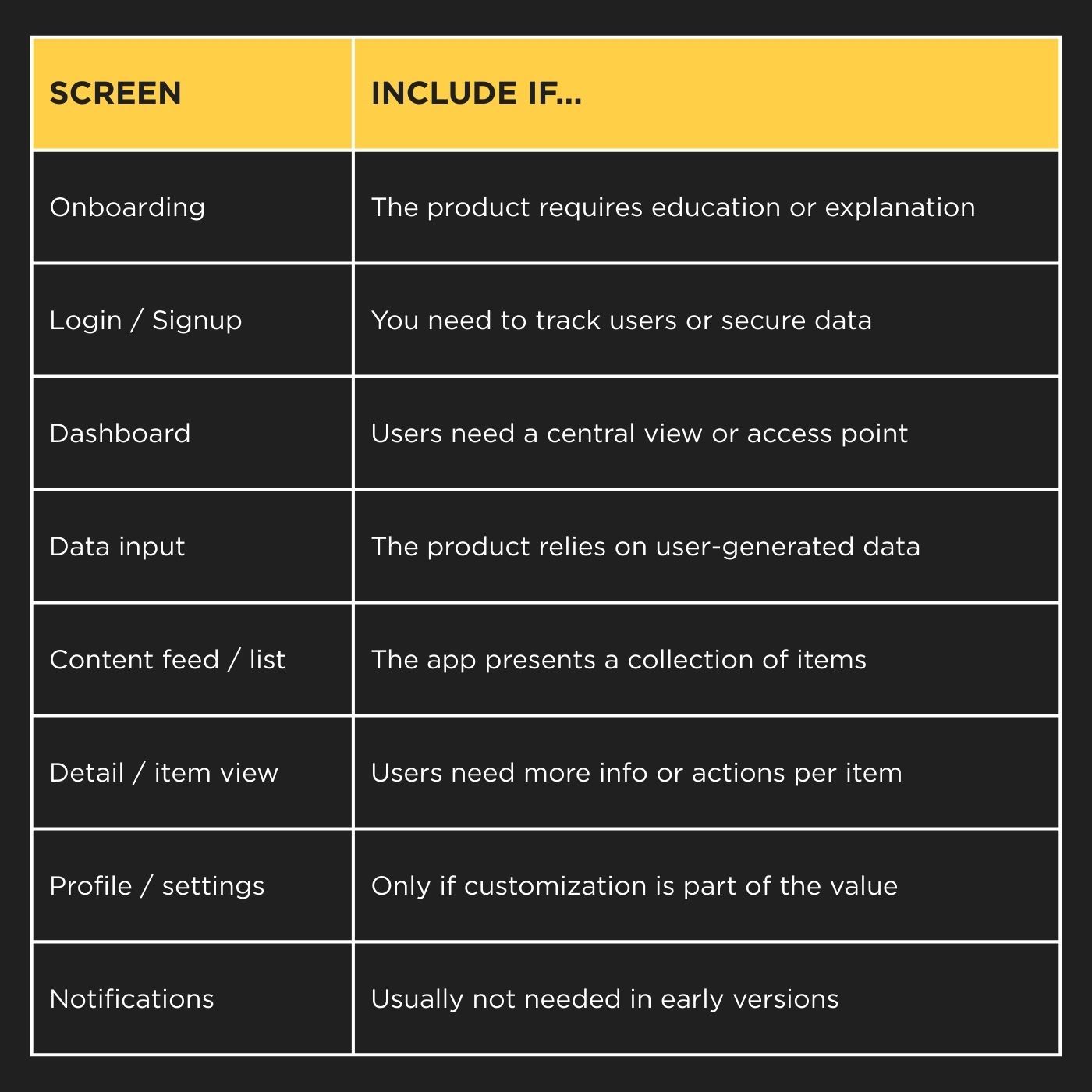
Typical MVP screen types
Below are common types of screens in MVPs, and when they’re actually needed:

Most MVPs don’t need all of these. Choose only those that are essential to your value proposition.
Example: MVP for a meal planning app
Imagine an MVP for a simple meal planner. The goal: help users organize weekly meals and generate grocery lists.
The critical path might include:
- Welcome screen
- Signup / login
- Weekly planner
- Add new meal
- Grocery list view
- Profile (optional)
That’s 5–6 screens. Enough to offer value, collect feedback, and test market fit….without overbuilding.
A SaaS analytics MVP, by contrast, might just include a login, a dashboard, and one report view (three screens total). Simpler structure, but still enough to validate the core value.
Mobile vs Web MVPs
- Mobile MVPs tend to have fewer screens because of space and user behavior. Each screen should focus on a single action.
- Web MVPs might include more views if there are admin panels, dashboards, or complex data structures (but the same logic applies: focus on the core journey).
In both cases, reducing screen count is about increasing clarity and speed.
Best practices when defining MVP screens
🔹 Use consistent, component-based design to speed up implementation.
🔹 Limit each screen to one primary action or decision point.
🔹 Avoid multi-step flows unless absolutely necessary.
🔹 Think in terms of value delivery per screen: does this screen help the user achieve something meaningful?
🔹 Build for learning, not scaling (yet). You’ll iterate based on what users actually do, not what you think they want.
So, to sum up, how many screens should an MVP have? Only the screens required to test your core idea. In most cases, that’s between 5 and 10 well-designed screens (no more). The goal of an MVP is not to be impressive. Always remember that. It’s to be effective. Strip away everything that doesn’t contribute to learning, validation, or core functionality.
Once you validate your assumptions, you can start adding features and screens with confidence…backed by real data.
At Acid Tango, we’ve helped dozens of startups and innovation teams design, build, and scale successful MVPs. Whether you're starting from zero or refining a concept, we combine UX/UI design, clean code development, and lean product strategy to get you to market with confidence.
Let’s talk about how we can bring your MVP to life.
